The Smartest World Cup AD Is a Shelf You Can Buy
Every brand wants into the World Cup. Most reach for the obvious — a star player, a stadium stunt, a logo on a kit.IKEA Canada looked at the same moment and asked a quieter question: what if the product itself was the spectacle, without borrowing anything to make it interesting?
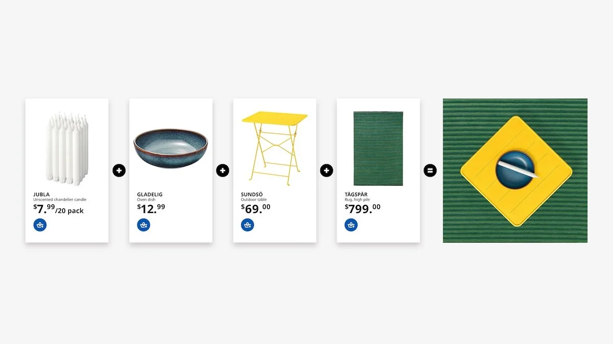
The answer is "Assemble the World," built with Dentsu Creative. IKEA took its own products — cushions, rugs, lamps, candles, storage boxes, plush toys — and arranged them into the national flags of 18 World Cup nations. England's flag is a grid of red storage boxes inside a white KALLAX shelf. Brazil's is a green rug, a yellow folding table, and a scatter of small items forming the blue center. Canada's maple leaf is a folded towel.
No FIFA branding. No athlete. No stadium.Just the catalog, styled until it reads as a flag.
Here's why it works, and it's a different trick than most "clever" World Cup campaigns pull. Most branded content picks a side and loses. Either it entertains, and the product disappears, or it pushes the product so hard the entertainment evaporates.
IKEA collapsed the two. The thing you're enjoying —decoding which household objects make up the flag — is the product catalog. You can't separate the fun from the merchandise, because they're the same image.
That only works because IKEA didn't borrow meaning from football. It borrowed meaning from its own core verb:assemble. The products "come together" into a flag the same way they come together on your living room floor from a flat-pack box. The World Cup gave the campaign a moment, but the idea was already sitting inside IKEA's identity.
The strongest branded content isn't your product placed next to something interesting. It's your product being the interesting thing. Before you borrow a trend's energy, look at what your business already does and ask whether that could carry the idea on its own. Borrowed relevance fades when the moment passes.IKEA's flags still make sense in August because the concept was never really about football.
A normal ad interrupts you and asks for a few seconds.IKEA's flags do the opposite — they invite a second look. You see a flag, then you notice it's made of trays and candles, then you want to figure out which products. The campaign gives you a small puzzle and lets curiosity do the rest.
That second look is the entire game. It's what earns the share, because people forward the thing that made them go "wait, how did they do that" — not the thing that shouted at them.
Content that rewards attention travels further than content that demands it. If someone has to slow down to get your post fully — and feels smart when they do — they're far more likely to send it to someone else. Build the double-take in on purpose.
This is the part most brands would have missed.Each flag isn't just admirable; it's a functioning cart. Spot the products, click, buy them. The tagline is literally "Click, Buy, Wave." As Dentsu's creative director put it, you can shop it, share it, sit in it, or tape it to your car window.
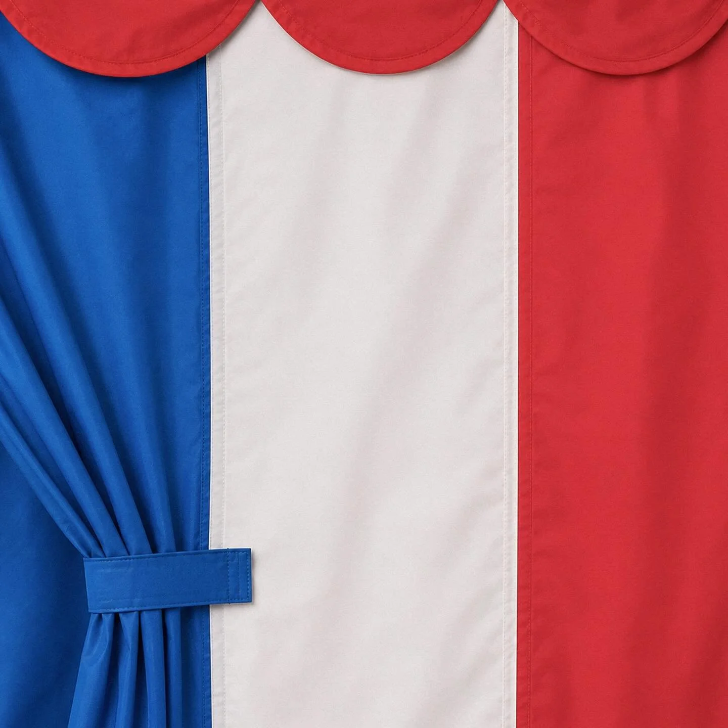
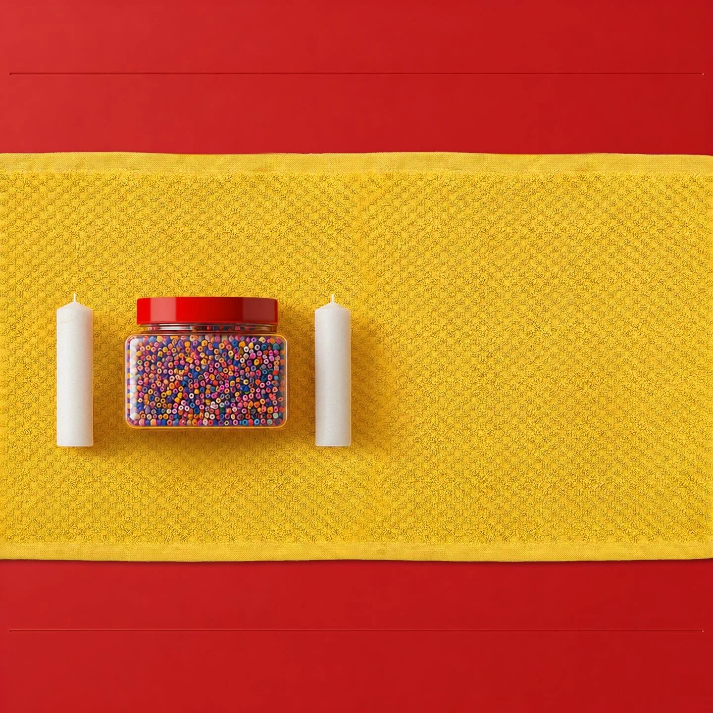
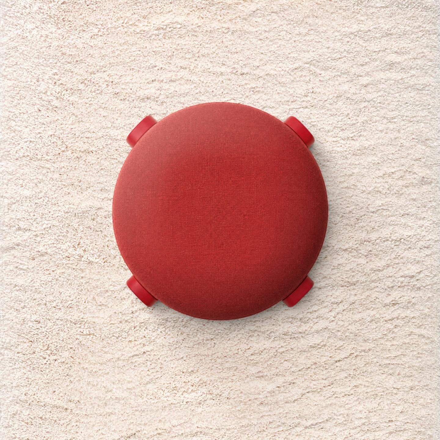
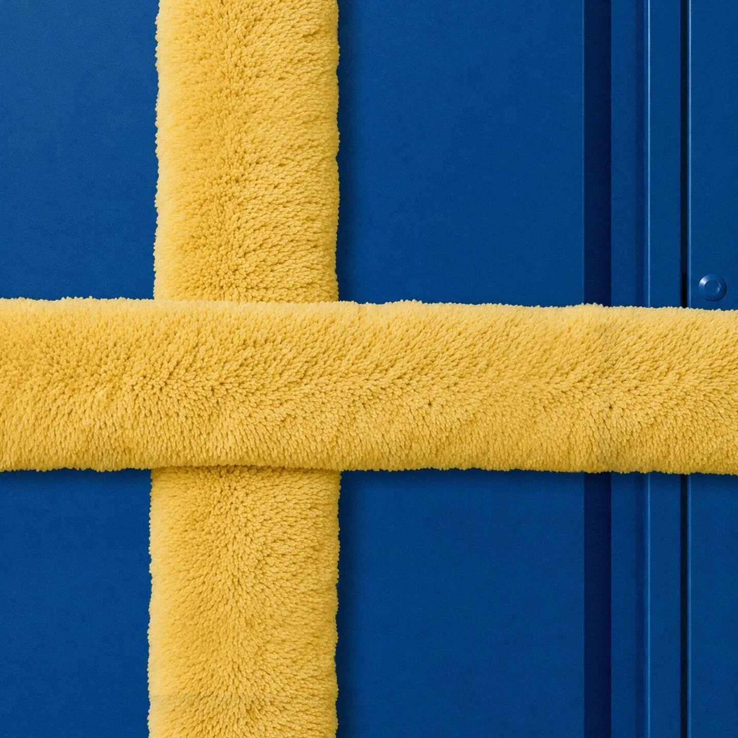
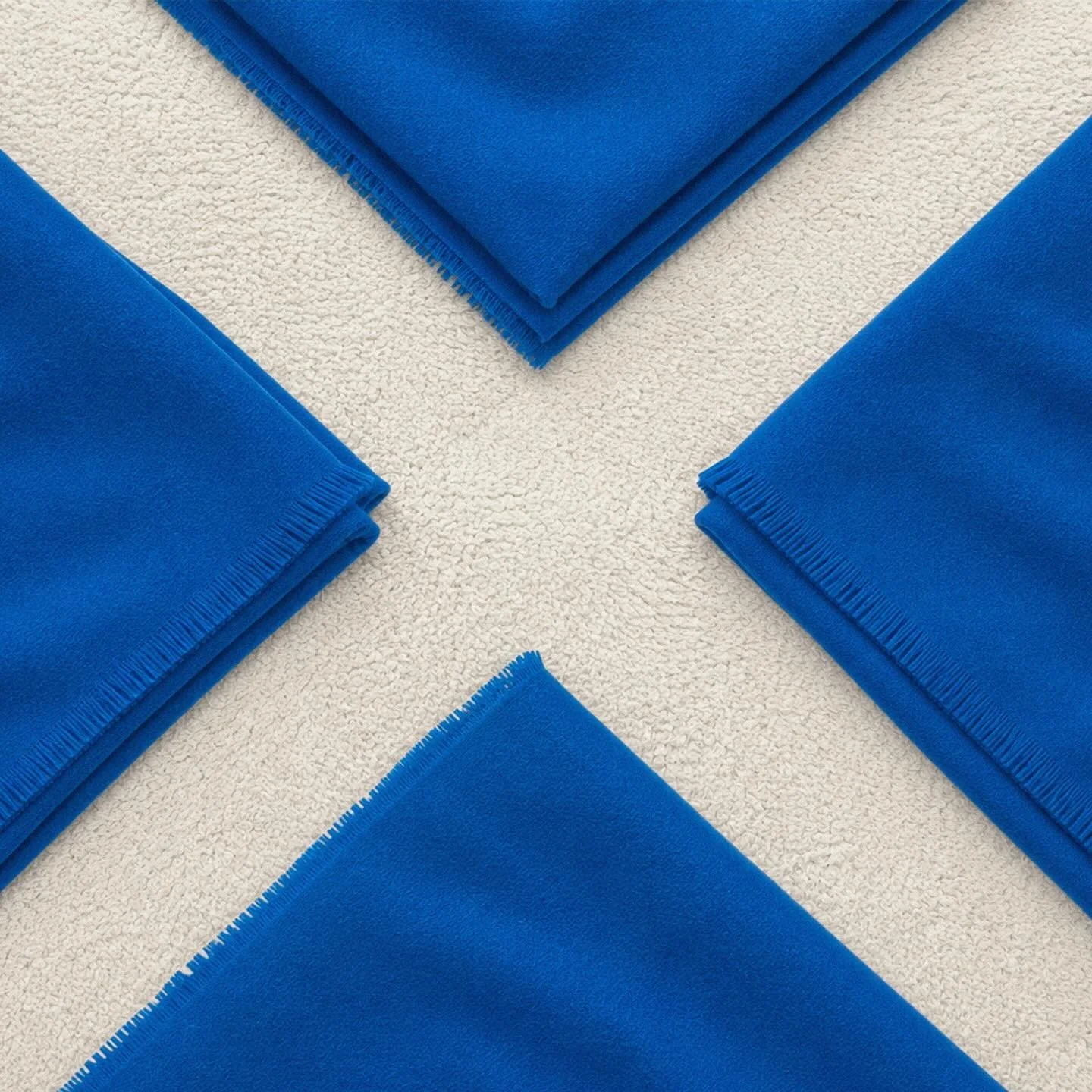
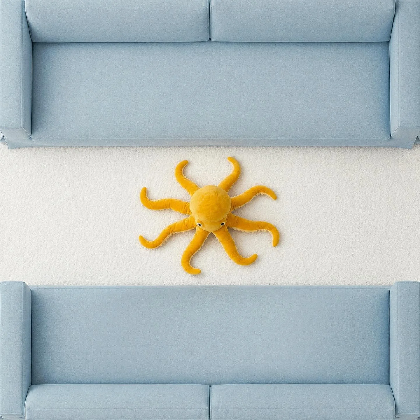
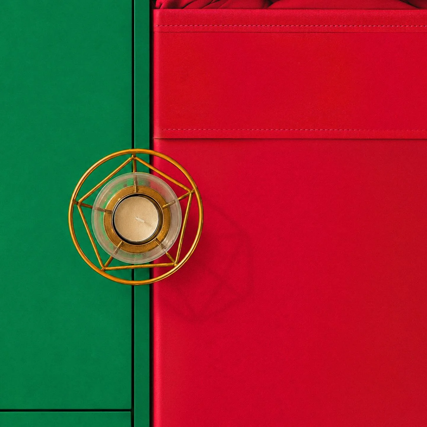
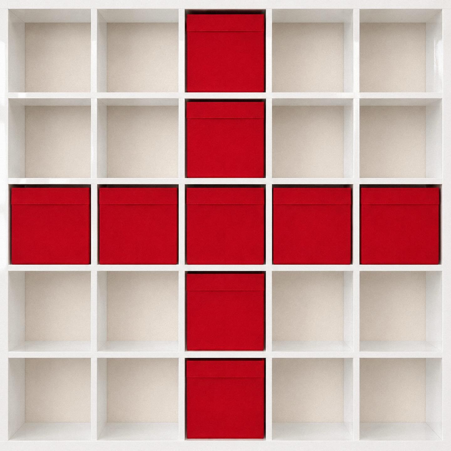
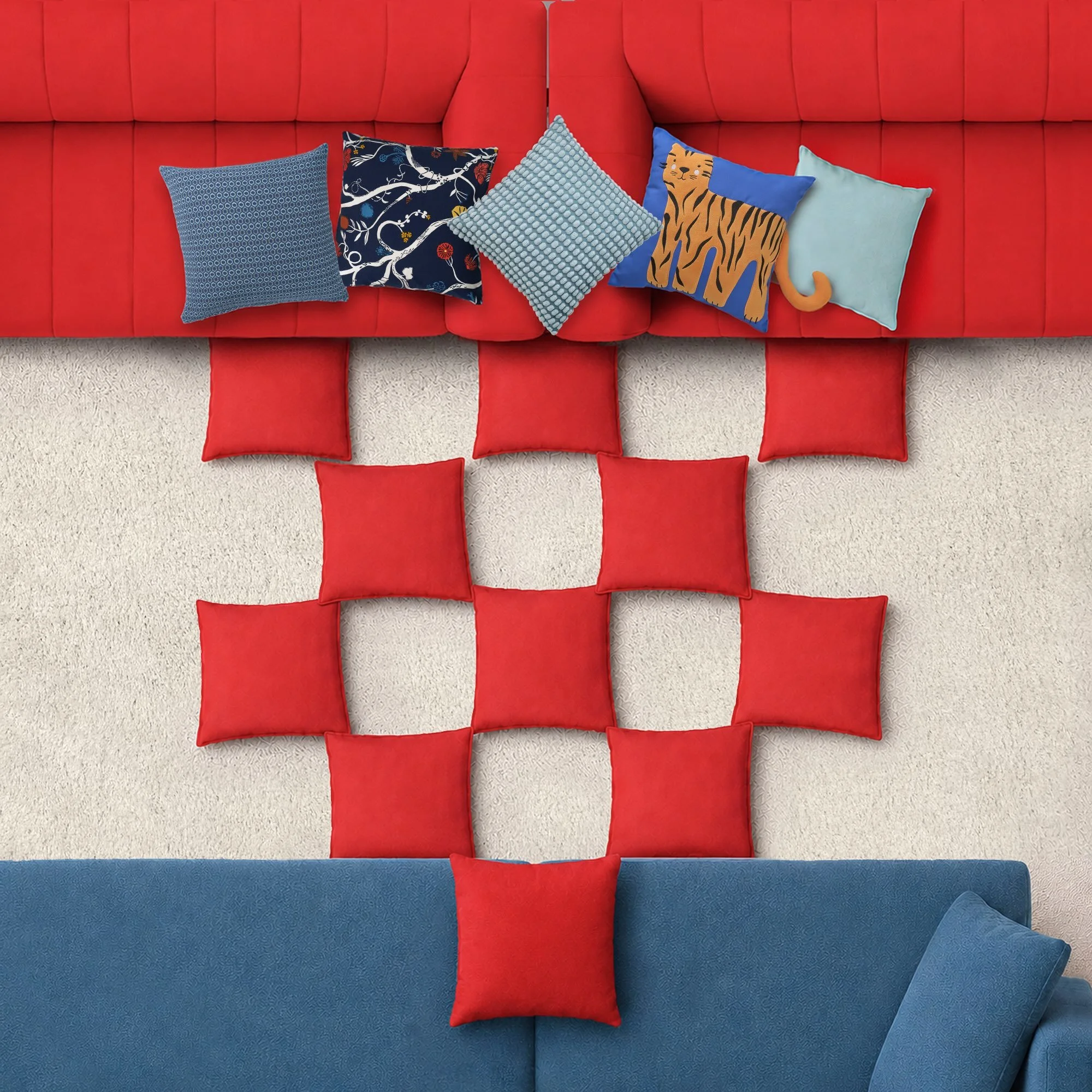
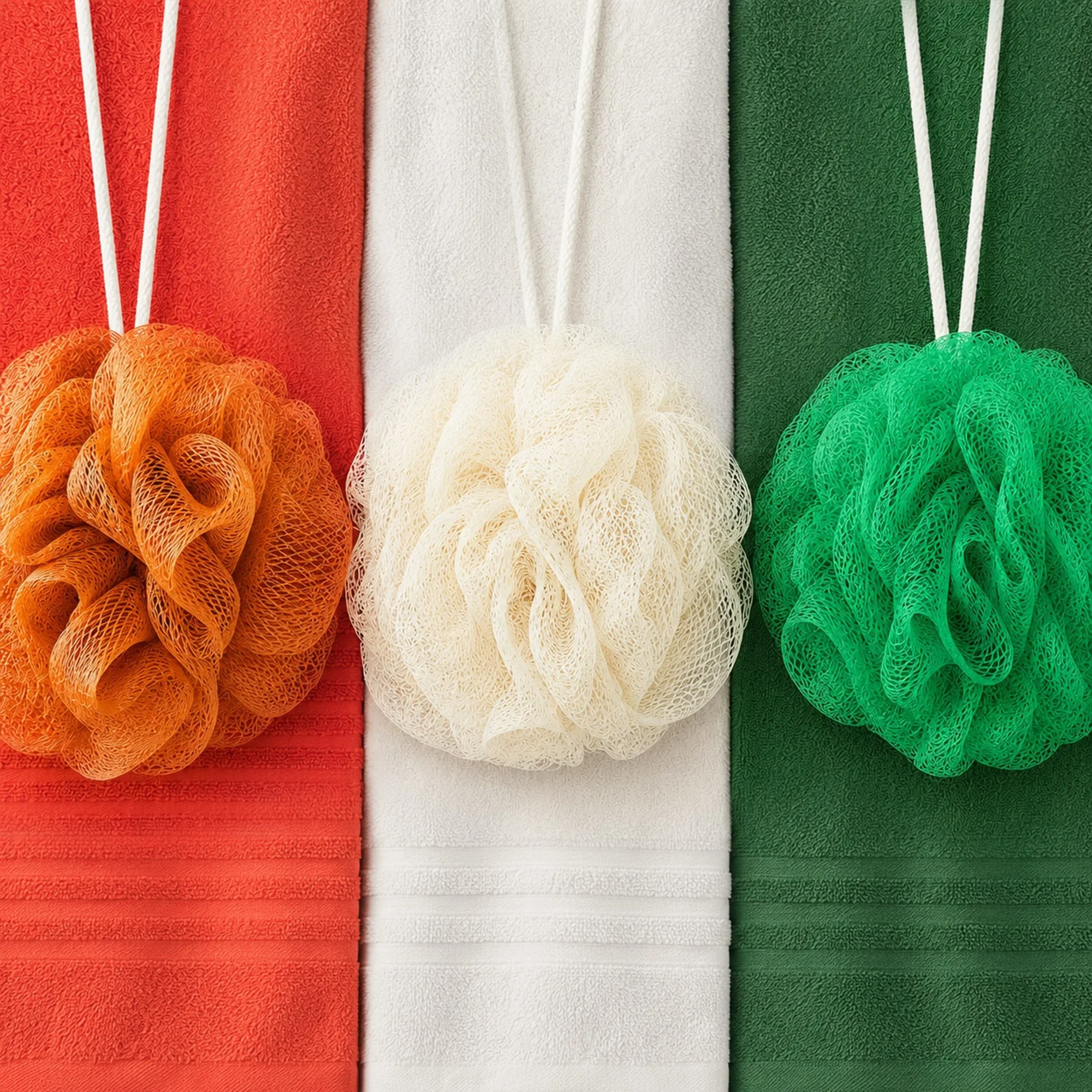
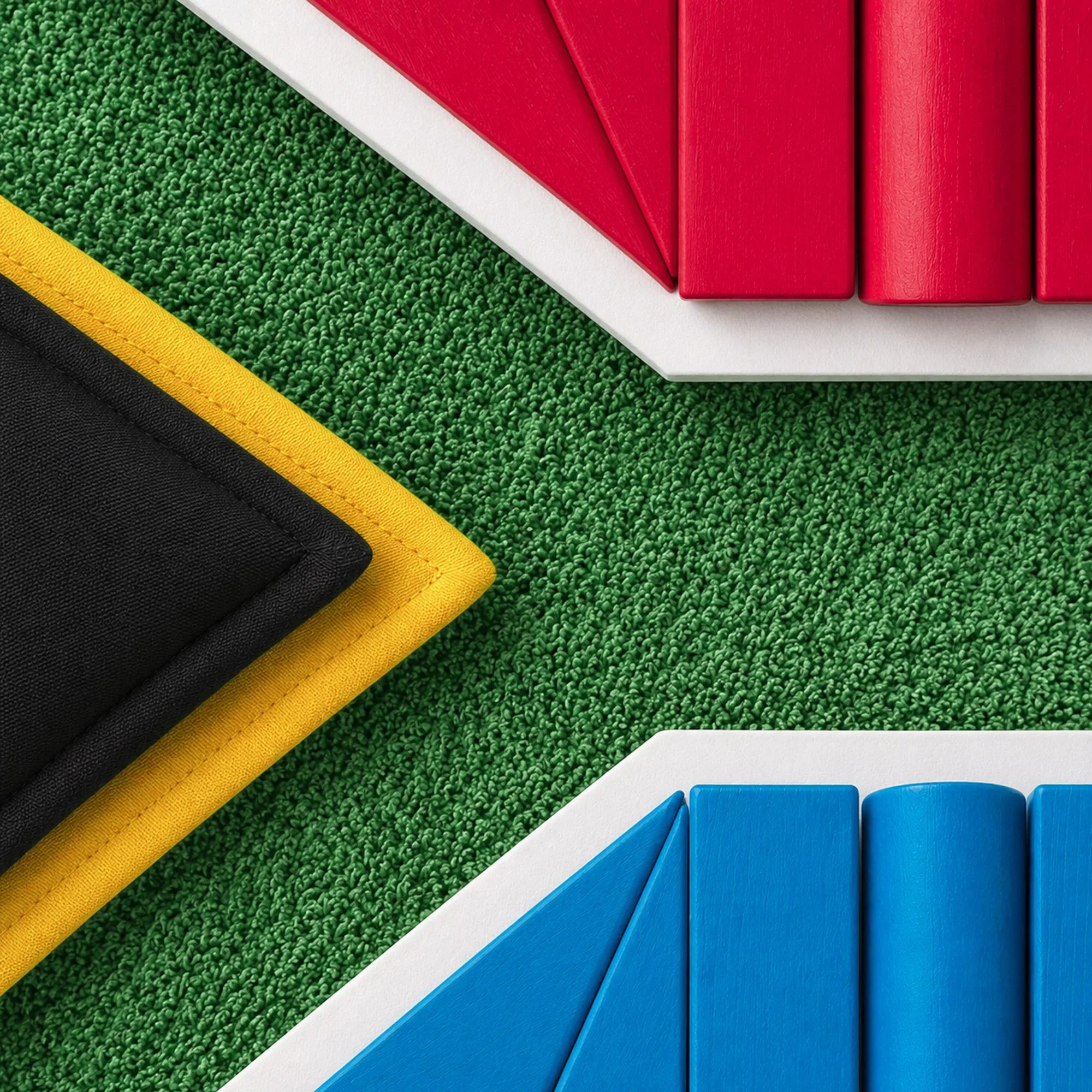
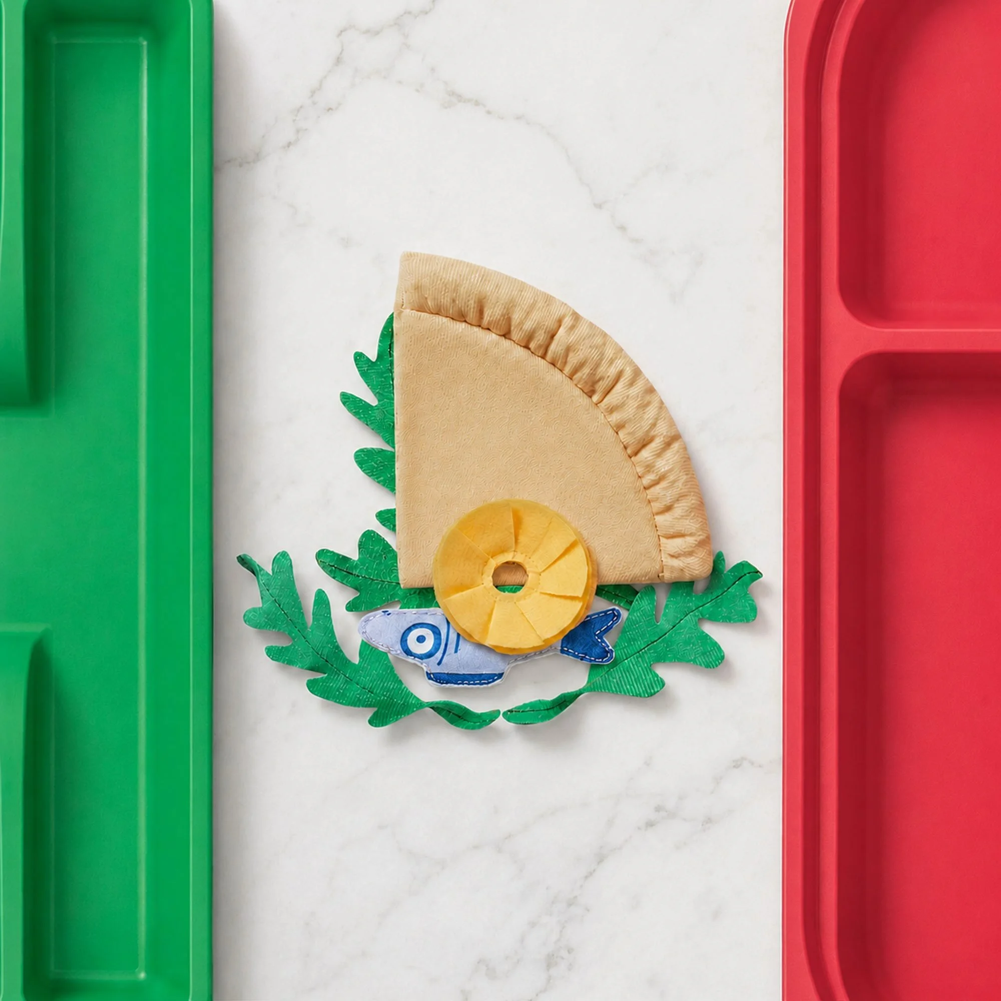
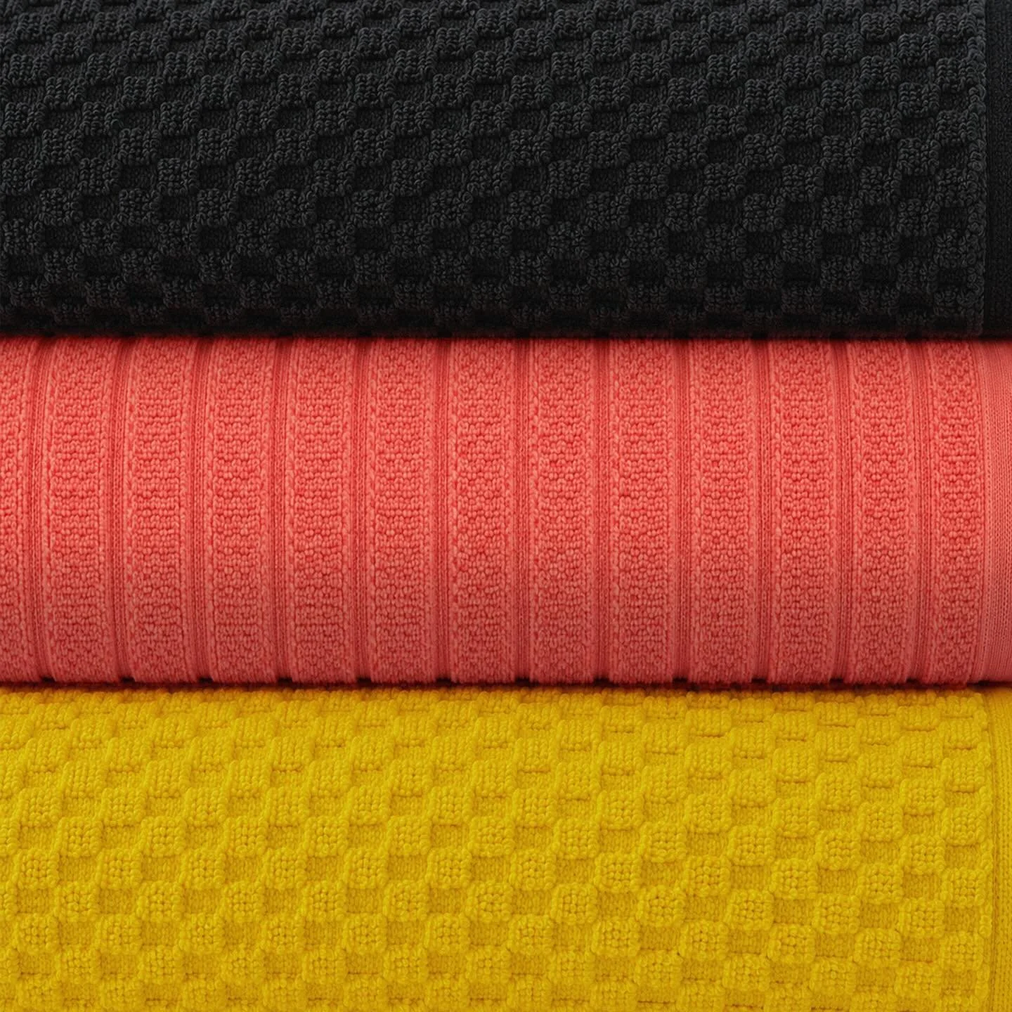
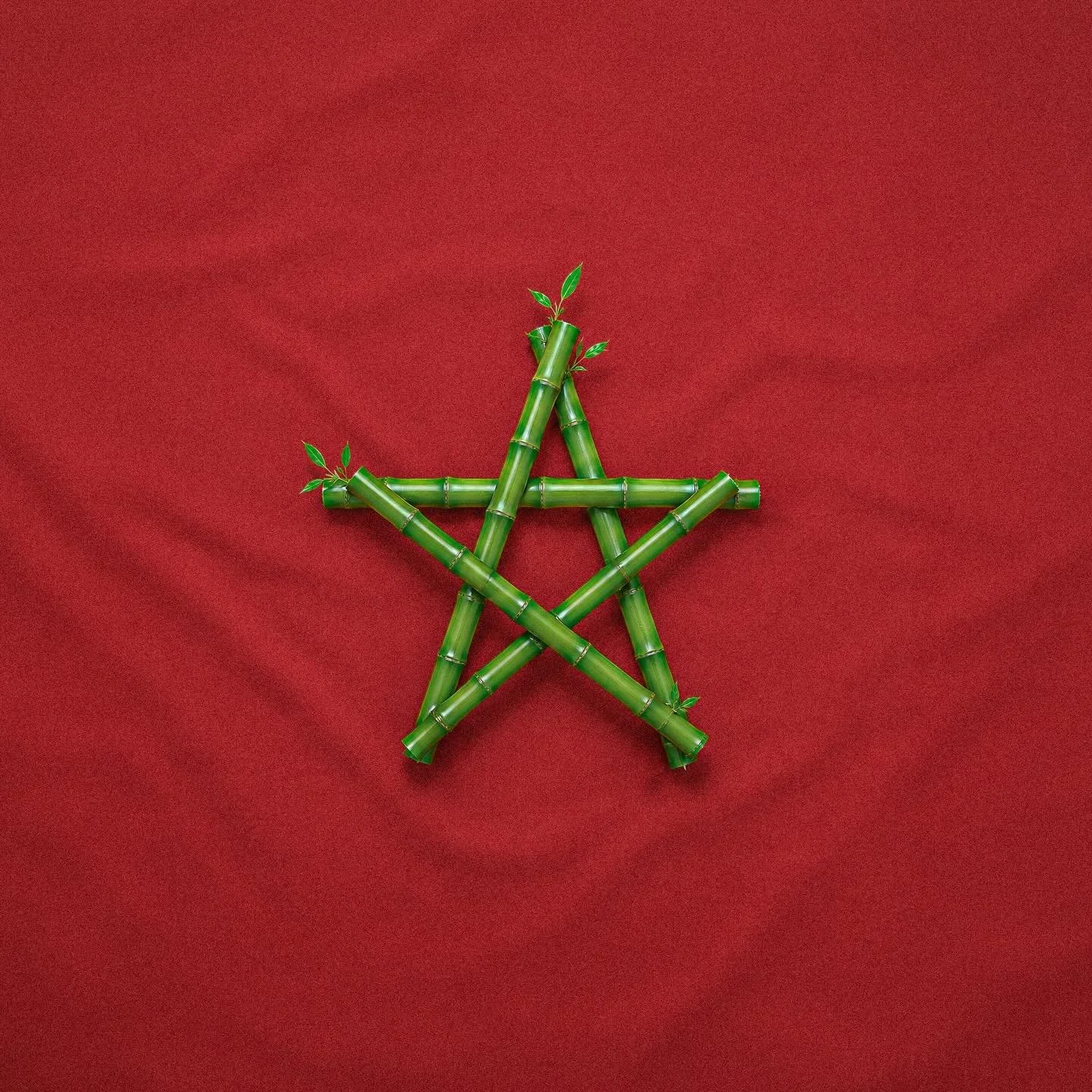
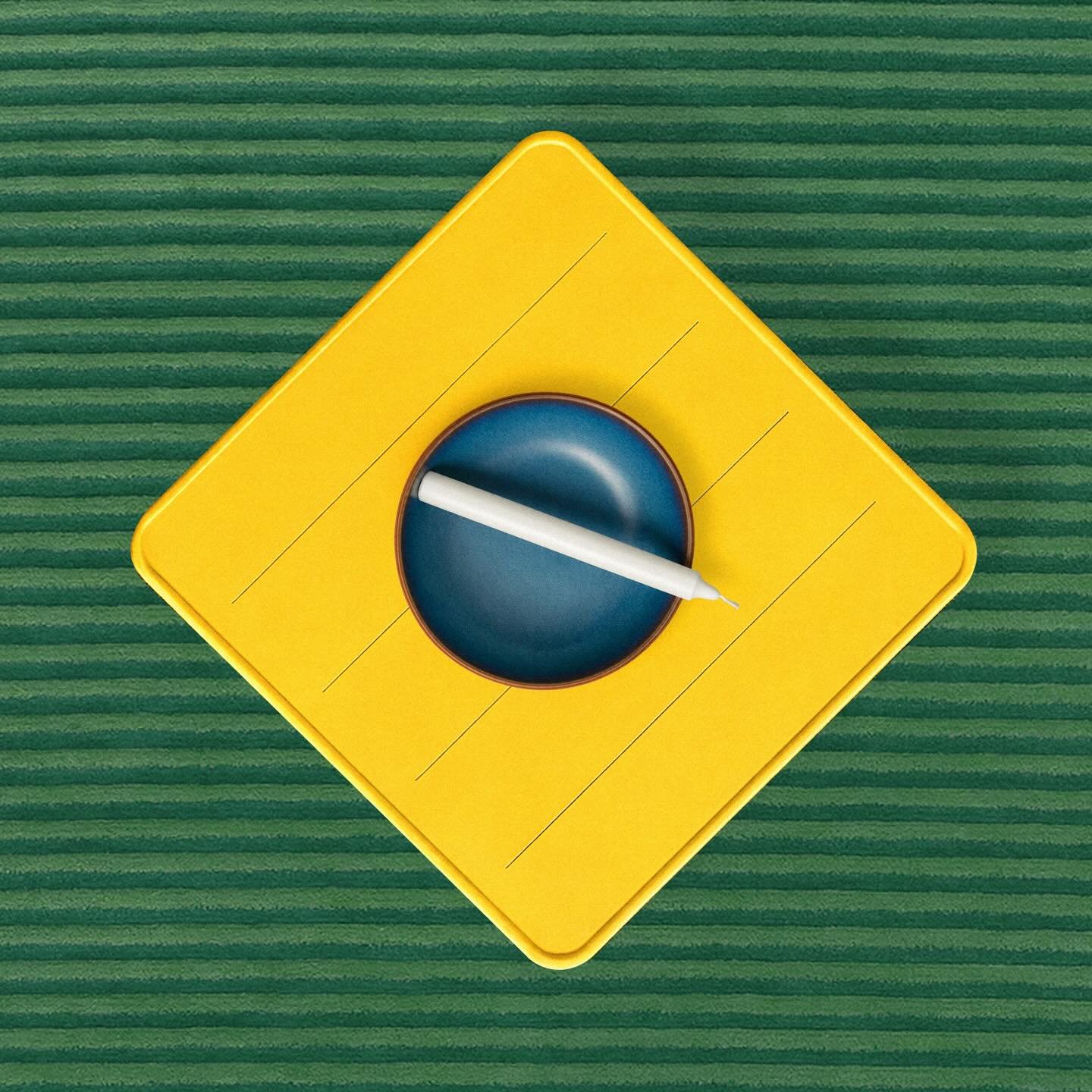
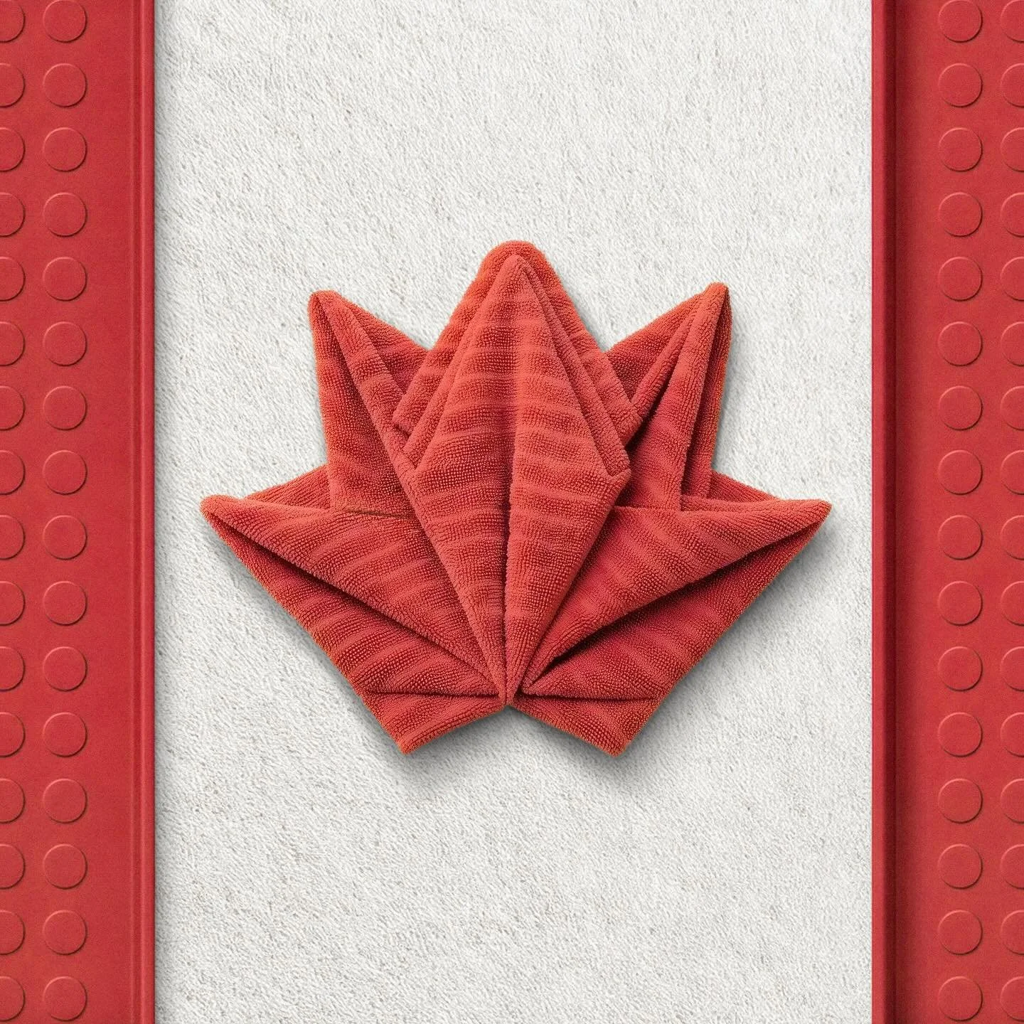
So, the campaign converts admiration into a transaction without breaking the playful tone. The moment of "that's clever" and the moment of "I could buy that rug" are the same.
When you make something fun, make sure the fun has somewhere to go. A viral post that leaves people with nowhere to click is a missed sale. Build the next step into the content itself — the link, the offer, the "here's how you get this" — so curiosity has a path to a purchase.
Worth noting what IKEA left on the table. No celebrity. No stunt. No attempt to out-shout the sponsors fighting over the same six weeks of attention. It backed a quiet visual game and trusted it to travel.
That restraint is a choice most brands can't make, because a quiet idea has to actually be good to survive. A loud one can hide behind budget. IKEA didn't have that crutch and didn't want it.
You don't need to be the loudest brand in the moment. You need one idea sharp enough that it doesn't need volume. If your concept only works with a big media push behind it, the concept isn't finished yet.
You don't have a catalog of thousands of products in every color. The thinking still transfers.
Audit your own stuff for a hidden visual story. Your tools, your ingredients, your workspace, your finished work. Is there a shape, a pattern, or an arrangement in what you already sell that could become something recognizable?
Make it a puzzle, not a poster. Give people a reason to look twice. The double-take is what gets the share.
Tie it to your actual identity, not just the trend. IKEA used "assemble" because that's what IKEA is. What's your version of that — the one verb your business already owns?
Give the fun a destination. If the post lands, where does the interested person go next? Build that step in before you publish, not after.
Cultural relevance is supposed to require a sponsorship budget.IKEA spent none and made one of the most-shared campaigns of the tournament out of inventory it already owned.
It didn't dress its product up as football. It found the version of the moment that only IKEA could make — its own catalog, its own verb, styled into something people wanted to solve and then buy
That's the move. Not "how do we get into the trend," but "what's the version of this trend that only we could make?" Your answer is already sitting in what you sell. Style it differently.